Brand Launch for iiM - Angel Investment Company
Today is the brand and website launch for iiM! This project has been different than many of my other projects, due to the fact that iiM is a bigger company and in the tech arena, quite a departure from working with my woman solopreneur! But it was a wonderful creative challenge and I’m excited to share about this project!
Innovation in Motion (iiM) is a Kansas City company that invests in companies and entrepreneurs in the Seed Stage and helps them grow so they can change the world.
I love that iiM is about investing in people who are wanting to make the world a better place for future generations and that really shows in the types of companies they work with.
Lydia, the Managing Director of iiM, reached out to me and was wanting a full refresh for iiM. She told me she felt that the brand and website felt dated and out of touch.
Here’s a look at what we started with:
Lydia wanted something strong, trustworthy, innovative, and one that easily showcased the high-level of what iiM offers as well as the types of companies iiM works with. And while this project was unique for me, I was excited to take on this creative challenge and deliver a high-quality brand for this well-respected company - in my hometown!
Some of the words used to describe iiM were: sophisticated, respected, established, successful, ambitious, thoughtful, intentional, innovative, visionary, trustworthy.
We started with a strong brand foundation, moved through the branding, then on to the collateral items, then ended with the website for a really seamless, cohesive updated presence.
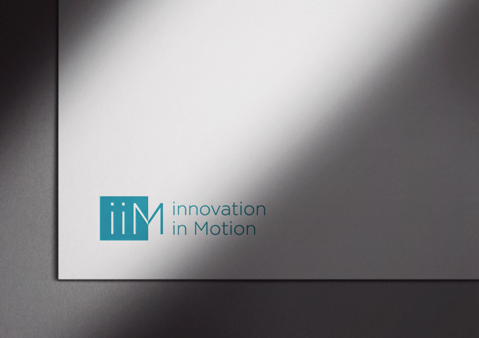
And we delivered on those adjectives with this elevated and appealing look. And Lydia agreed by saying “Our new branding better represents who our company is, and better aligns us with our peers.”
The colors are a mix of inviting, friendly, and trustworthy, and grounded. The perfect combination for this business.
Here’s a look at the Brand Style Guide, marketing materials, and new site:
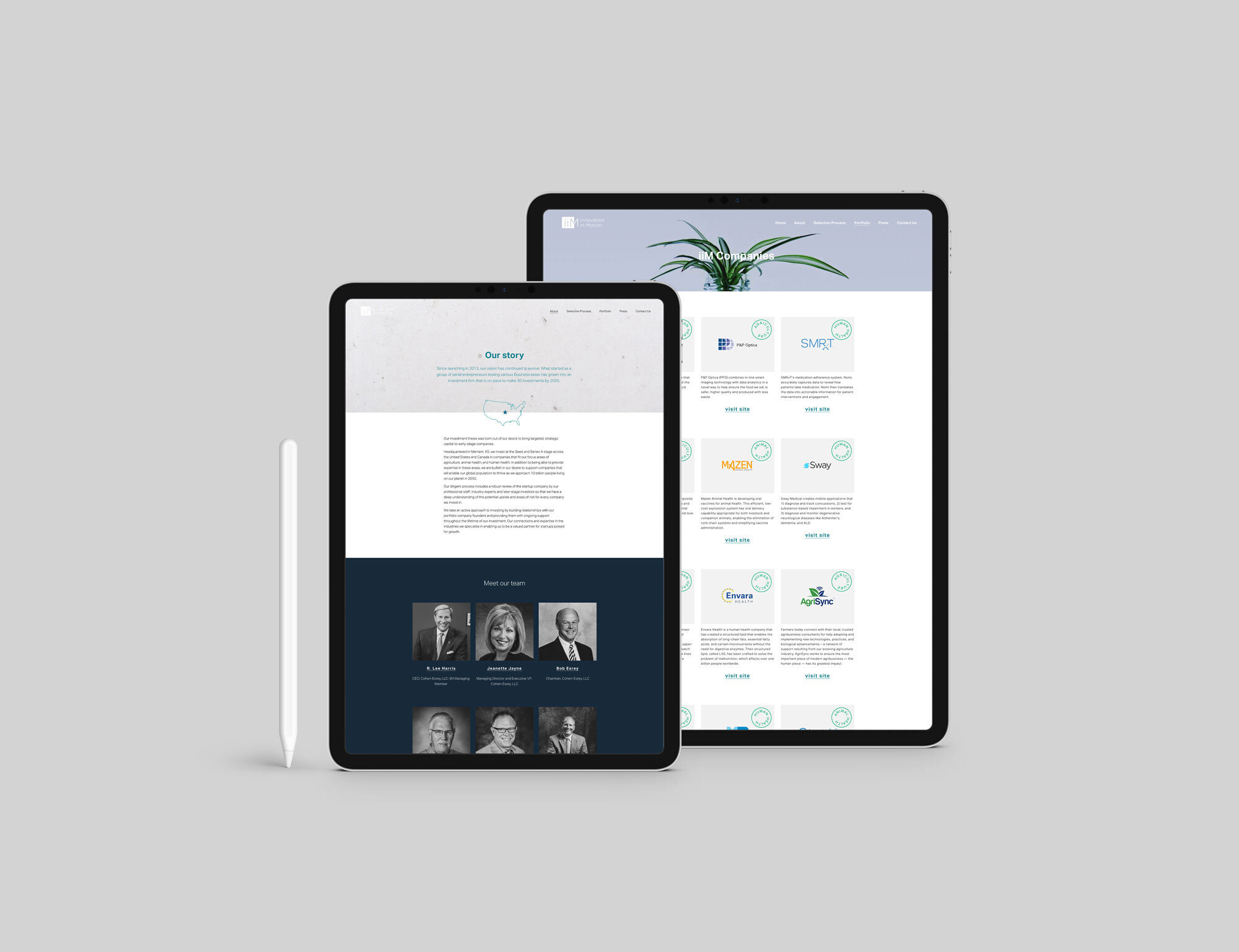
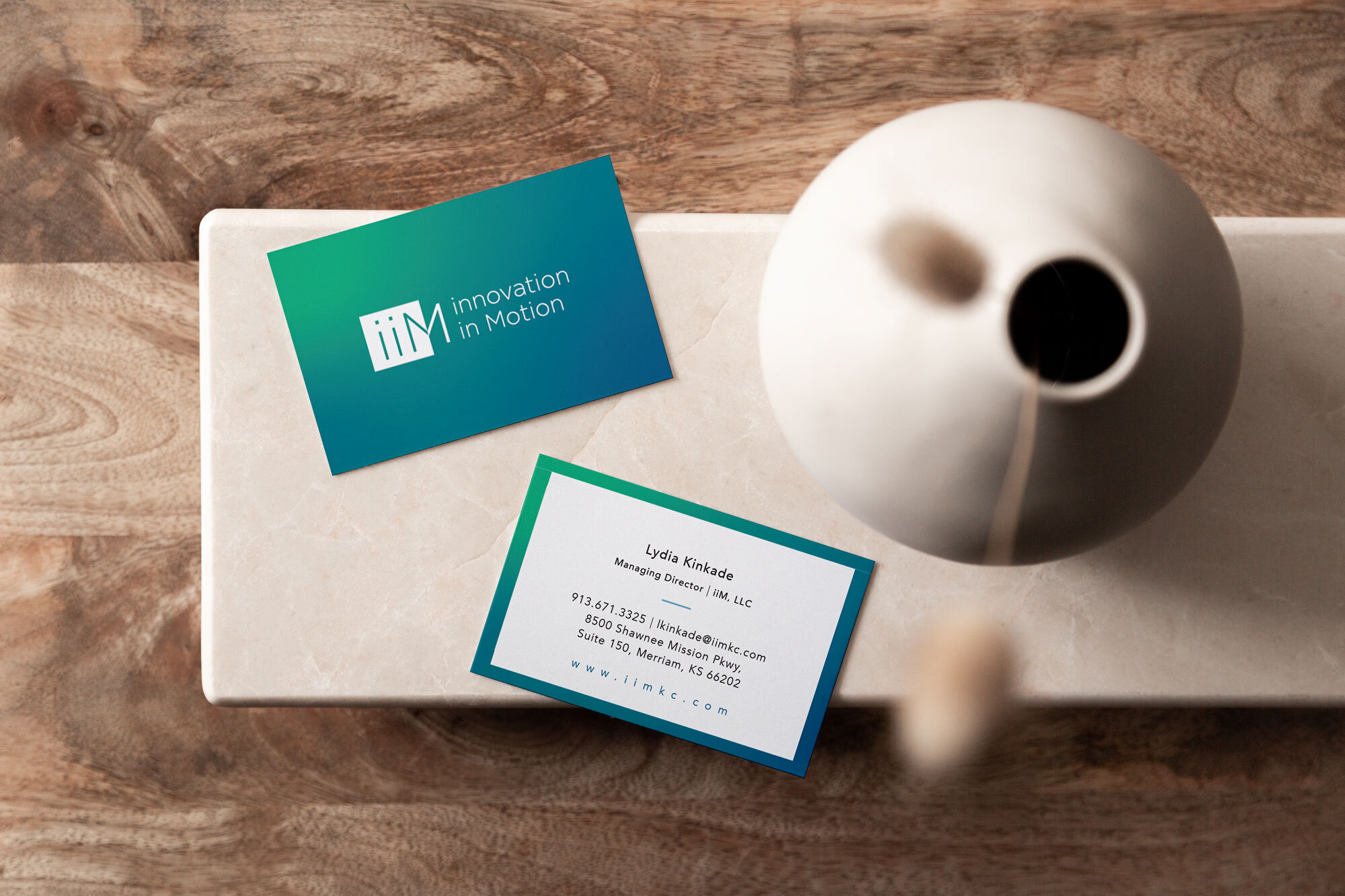
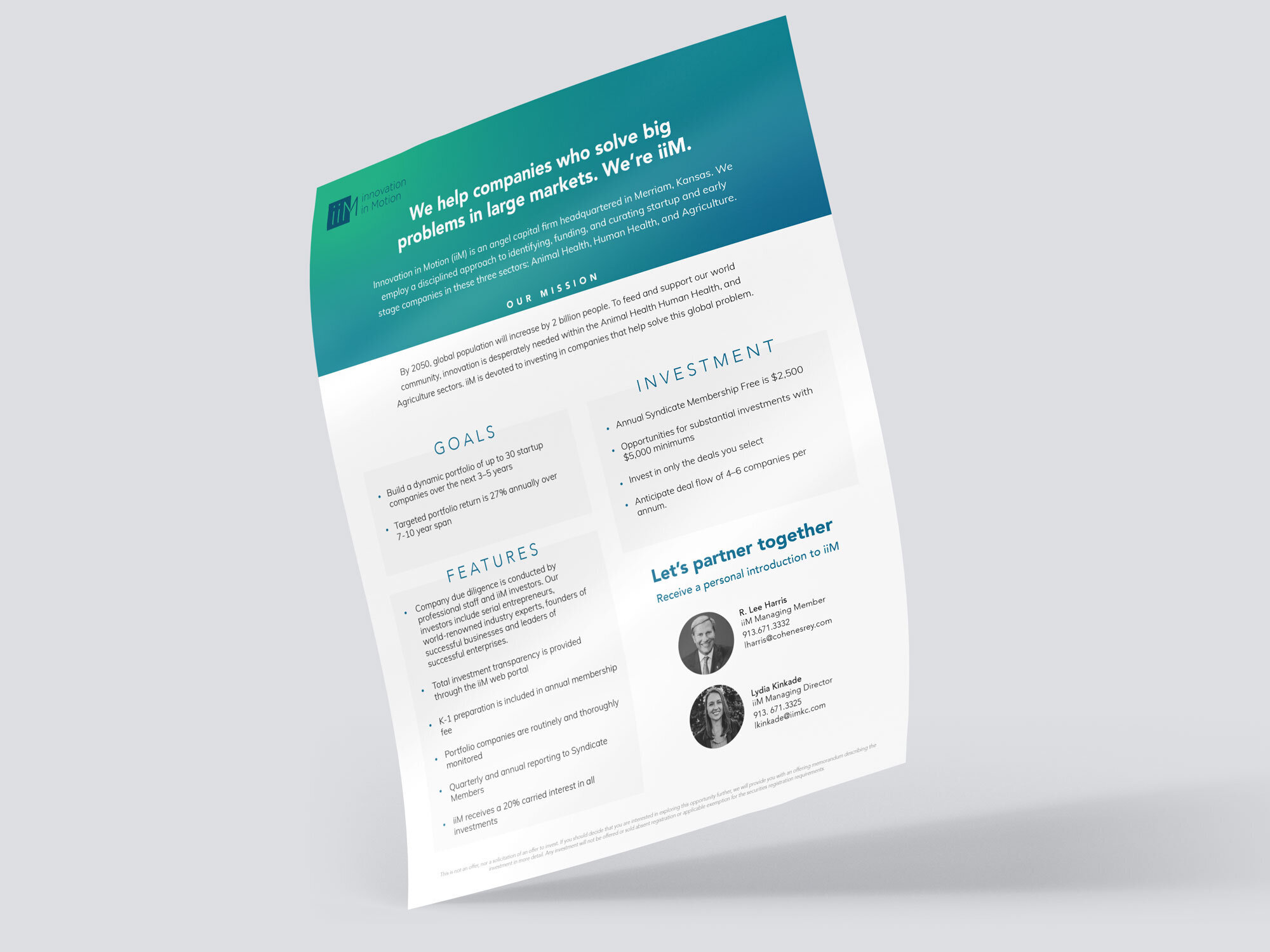
At the end of the process I asked if we accomplished her design goals and what was her favorite part of working together and here’s what she said:
“Yes! We wanted to enhance our professionalism with a new logo, color palette, and marketing materials - R Artspace delivered! It was fun seeing our inspiration board come to life through our new website and other collateral pieces.”
This visual brand and website now accurately reflects and quality and expertise that iiM provides and is inviting to potential entrepreneurs and investors alike.
Here’s what Lydia said about the process:
“RuthAnn listened intently throughout our process and applied our feedback quickly in order to fit our needs. She was timely, professional, and on top of things during each phase of our project. RuthAnn had sound design advice and was also open to our ideas for doing things differently. I really enjoyed working with R Artspace and would highly recommend the company to others.”
To view the new site and learn all about iiM, head over here.

