Color Psychology and the Impact it has on Your Brand
Color psychology is a rich topic. There are many facets to how color affects the human body as well as decision-making and mood. So, in terms of branding, color plays a huge role in the process of how people identify with your brand and how they relate to it.
According to research people make a judgement on your brand within 90 seconds of seeing your content. That’s a pretty quick assessment just based off colors alone!
So today we will take an in-depth look into the colors for your brand, find out what they're saying about you and make an informed decision based on research that can attract more of your ideal audience and communicate the right message.
Ultimately, you want your brand, even if it’s a personal brand, to resonate with the people you’re trying to connect with. If your audience is mainly men, it’s important to know if men are identifying with your color choices so you can attract more of your ideal client.
The truth is color increases brand recognition up to 80% so it's important to choose your colors carefully and with full knowledge of how they affect people you're trying to communicate to.
Before we dive into each color and identify strengths and weaknesses, here is a look at some color observations between men and women taken from this research.

As you can see already there are some stark facts about how men and women view certain colors but let's talk about each color in depth and how it can communicate your message to people.
Red
The color red is a very packed color with many emotions tied into it.
It is associated with: energy, power, danger, love, passion, aggression, energy, impulsiveness, and dominance.
Positive connotations are that it’s energetic, daring, passionate, and attracts attention more than any other color.
Negatively it can be tied to feeling anxiety, fearfulness, alarm, and danger.
Physiologically the color red increases heart rate, metabolism, and makes us breathe faster. It is tied with aggression, physicality, passion and energy.
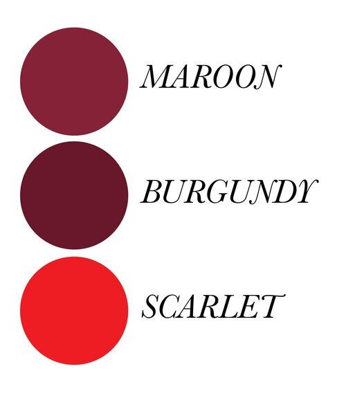
There are different shades to red. The darker shades indicate a more restrained feel. Darker shades also, such as burgundy and garnet, are more rich and refined while the brighter colors like scarlet have more energy attached to them.
Red is often used in food-centric brands as well as retail due to the fact that red increases appetite and can lead consumers to impulsive decisions.
A popular brand that uses red:

TAKEAWAYS
If your brand is energetic, enthusiastic, and full of adventure, using a brighter red sparingly is a great way to add those elements. If your brand is more luxury and you want to attract a more high-end clientele, a darker shade of red such as burgundy is a great way to do that.
Orange

As we observed in the first infographic, orange is not a favored color by either gender. It is more associated with younger ages and displays enthusiasm, energy, originality, and excitement.
Positive ties: orange shows confidence, enthusiasm; displays energy, vitality, and charisma.
Negatively: can be seen as cheap, insincere, superficial, unsympathetic, and proud.
Physiologically, it brings energy and excitement to thoughts and mood.
Orange isn't used as a main color in brands very often due to the fact that neither men nor women connect with it. It is more often used with youth activities, sports, or children's products or toys because children and youth tend to gravitate to this color more than adults. A more burnt orange is associated more with nature and fall but can often be seen as dull or boring. Coral is a brighter color and when used strategically can add playfulness and youthfulness to a brand.
A well-known brand to use orange is

TAKEAWAYS
It's important you know your audience if you choose to use orange. Like I said, if you're using it sparingly and in combination with other sound and likable colors it can be the perfect addition. Orange is a complimentary color for blue, so using the two together can be a winning combination and can demonstrate confidence, stability, and energy.
Yellow

Yellow is known for being whimsical, energetic, youthful, friendly, happy, warm, and fun-loving.
Positive connotations: it's energetic and fun. Yellow shows charisma, optimism, cheerfulness, care, and can commonly be seen as affordable.
Negatively it can cause people to think of caution; it's emotional fragile, can be seen as impulsive and impatient.
It is commonly used in brands geared more toward children and can bring a youthful energy.
Physiologically it increases mental activity, awareness, and energy. It's the brightest of all the colors and attracts attention the quickest.
Lighter shades of yellow imply creativity, youthfulness, and optimism while darker shades such as mustard can be seen as unfeeling and uncreative. Gold on the other hand can be seen as expensive, luxurious, indicate wealth, and add sophistication while on the other hand gold can also represent ego and be seen as unfeeling.
Unfortunately, according to this study yellow was indicated to be among the least favored color by both men and women.
Yellow is often used in youthful brands and children's toys and also brands that showcase creativity and optimism such as:

TAKEAWAYS
Yellow is used most often when gearing a product or service toward a younger market. Although darker shades and gold colors are used with older age ranges more often than not it's towards a women's market. Generally, yellow not a favorable color. Gold is seen as luxurious and refined and can add a touch of elegance to a brand but beware that if your target market if men, yellow may not be the best color to reach them.
Green

Green is commonly known for being environmental and eco-friendly.
Positives: green is liked by both men and women; it is associated with feelings of calm, tranquility, and sincerity. Green is filled with positive energy and feelings of both life and renewal.
Negatives: Sometimes green is associated with envy, greed, and corruption.
Green is balancing, soothing, and also rejuvenating.
In general, green is a great color to use and is well-liked across the board. It is known for positive thinking, nurturing, caring, and calming. Darker shades of green are most often in correlation with relaxation, and peace. And light tints of green such as mint give off feelings of refresh, cleanliness, and space.
A popular brand that uses green is
TAKEAWAYS
Using green as a part of your color scheme can be great to add feelings of refresh, serenity, and growth. If your brand is environmental or provides a service geared toward cleanliness or relaxation, green is the way to go. Probably a mint for relaxation and a brighter green for energy and growth.
Blue
Blue is often associated with loyalty, security, calm, and peacefulness. It also inspires creativity and is fundamentally liked by both men and women.
Positively it can show intelligence, trustworthiness, sincerity, confidence, reliability, and virtue.
Negatively, it can show indifference, indicate loneliness and coldness.
Physiologically it is known to slow down heart rate and increase feelings of calm and peacefulness. Blue is non-threatening but can also show aloofness.
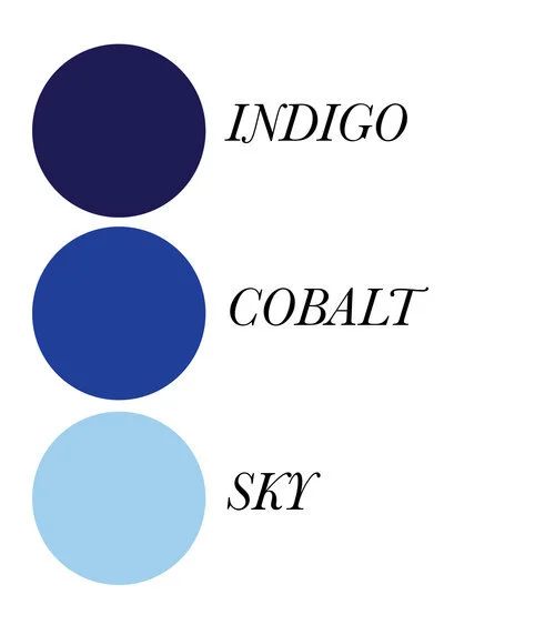
Lighter shades of blue are linked to creativity, peacefulness and calm while darker shades of blue link to security, trustworthiness and confidence.
Often used in brands that want to show reliability and truthworthiness, many financial institutions and social media industries use blue to communicate those feelings of safety and security.
Well-known brand to use blue

TAKEAWAYS
Blue is universally liked the most by both men and women and has positive connections associated with both dark shades and light tints of blue. If you want to come across as trustworthy, reliable, and confident using a blue is a great way to go. If your brand is more delicate and calming such as a spa, a lighter shade would be more appropriate.
Purple

Purple is a combination of both the passion and boldness of red and the calming, serene affects of blue. It is associated with royalty, imagination, luxury, originality, and spirituality.
Positive connotations: power, dignity, magic, royalty, and unique.
Negatively: complex, snobbiness, sensitive, and can be considered gloomy.
Psychological effects: increased creativity and intuition.
Purple is one of those colors that is unique and conveys a certain level of independence and originality so brands that use purple often produce creative goods or promote originality or spirituality.
Darker shades are associated with royalty and luxury. In ancient times purple was very difficult to come by so often only the wealthy could produce and afford this color. In nature, purple is not common so it often seen as rare and delicate.
A brand who uses purple:

TAKEAWAYS:
Although purple is associated with luxury and royalty it is not often used in products due to the fact that it is so original and complex. It was the second least favorite color of men according to this research and thus is not used when catering to a male audience. Women, on the other hand, are attracted to this color for it's femininity and links to passion and refinement. If you choose to use purple in your brand, know who your target market is and how you want people to feel when they come in contact with your business. If creativity and inspiration are some of your values, this may be a perfect color to use!
Black, White & Gray
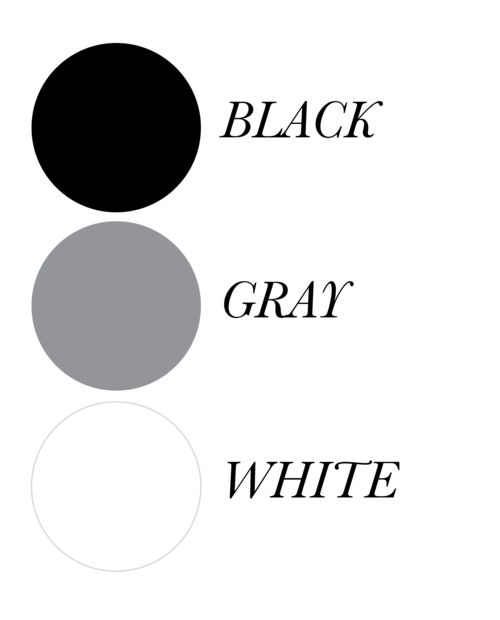
Black is associated with sophistication, independence, luxury, and class. Negatively, it can be seen as depressing, lack creativity, and be associated with fear. But more often than not, black is a great addition to a brand. It showcases luxury to both men and women and it can make a product seem more high-end and expensive. Black is often associated with tech.
Gray is seen as subtle, reliable, refined, and classy but on the other hand can seem dull, boring, and unimaginative. While gray is understandably neutral it is rarely seen as a prime color for brands. And due to the fact that gray is arguably an absence of color, those in marketing shy away from gray due to the fact that using color increases people's willingness to read a piece of content by 80% (source).
White embodies cleanliness, space, knowledge, innovation, class, and purity. On the flip side it can come across as sterile, blank, empty, and lonely. White is used often for high-end and luxury items and also used to represent cleanliness and clarity.
Here is an example of the Apple brand who uses white in their brand:
TAKEAWAYS
Using stark black and white colors for brands is decisive and bold. While gray isn't a sought-after color due to the fact that it is an absence of color, black and white colors both can display sophistication, class and tastefulness.
Brown

And finally, the color brown. Most often used in reference to the environment, it's known as reliable, stable, dependable, and organic.
Positives: it's known for richness, chicness, being classy, stable and traditional.
But as with all the colors, there's a negative side. It can be seen as boring, unimaginative, and dull.
Brown is found in the earth so naturally is known for the environment, being stable, secure, and reliable. You don't find too many brands who use brown as their main color because neither gender cares for this color and it was the least favorite color for men but nonetheless, if you want to display reliability and groundedness, brown is a good color choice.
Brand that uses brown:

TAKEAWAYS
As I've been saying during this whole post, it's important to know who you want to focus on and what you're offering. Probably men wouldn't be initially drawn to this color, but perhaps a tan could be used for a women-centric brand to give it a chic and tasteful addition.
This was an extensive look at colors, the meaning behind them, and how they affect people who view them. I hope this is helpful to you as you navigate your own brand or solidify what you already have. Let me know in the comments what you think of using colors strategically in your brand.
Was this study of colors helpful as you navigate your own brand?
What are the challenges you have as you use colors in your brand/business?