Week 4: Barb's Branding Journey - How to Use Your Brand Files and Marketing Collateral
About the episode:
We are wrapping up Barb’s rebranding journey with our final official episode of this series where Barb and I revise her Marketing Collateral and I also present all her final brand files and share how best to use them. In the first part of the episode we review the Marketing Collateral I sent over which was Instagram graphics and Barb’s opt-in design. In the second part of the episode I walk Barb through all her brand files and how to use her Brand Style guide, files, etc. I really hope you’ve enjoyed this comprehensive, behind the scenes look at how I work with my clients in their visual brand design and stay tuned for next week’s episode where we do a debrief and candid Q&A. Let’s go to the show!
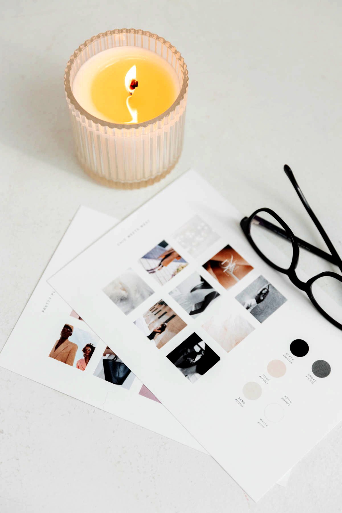
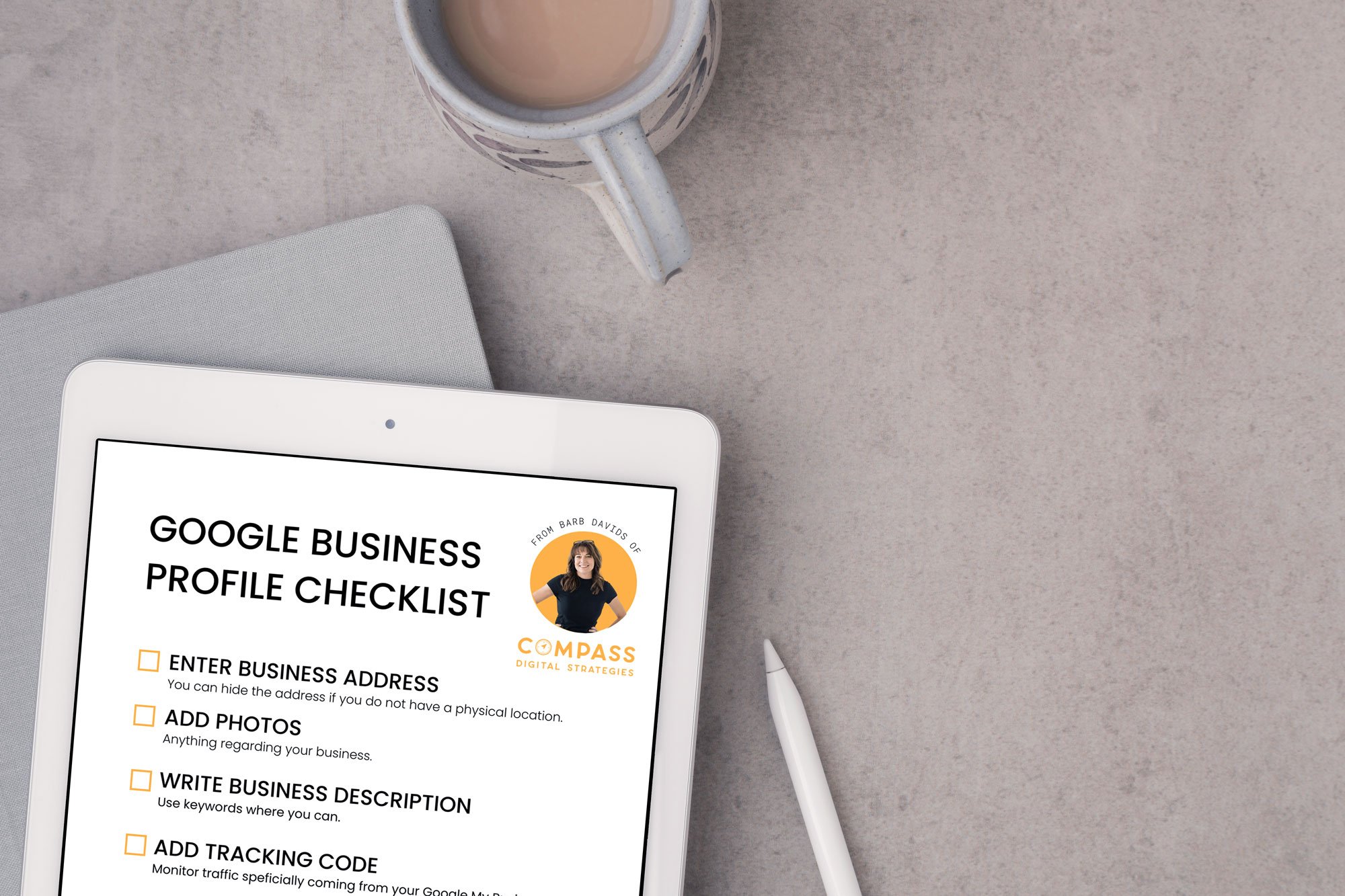
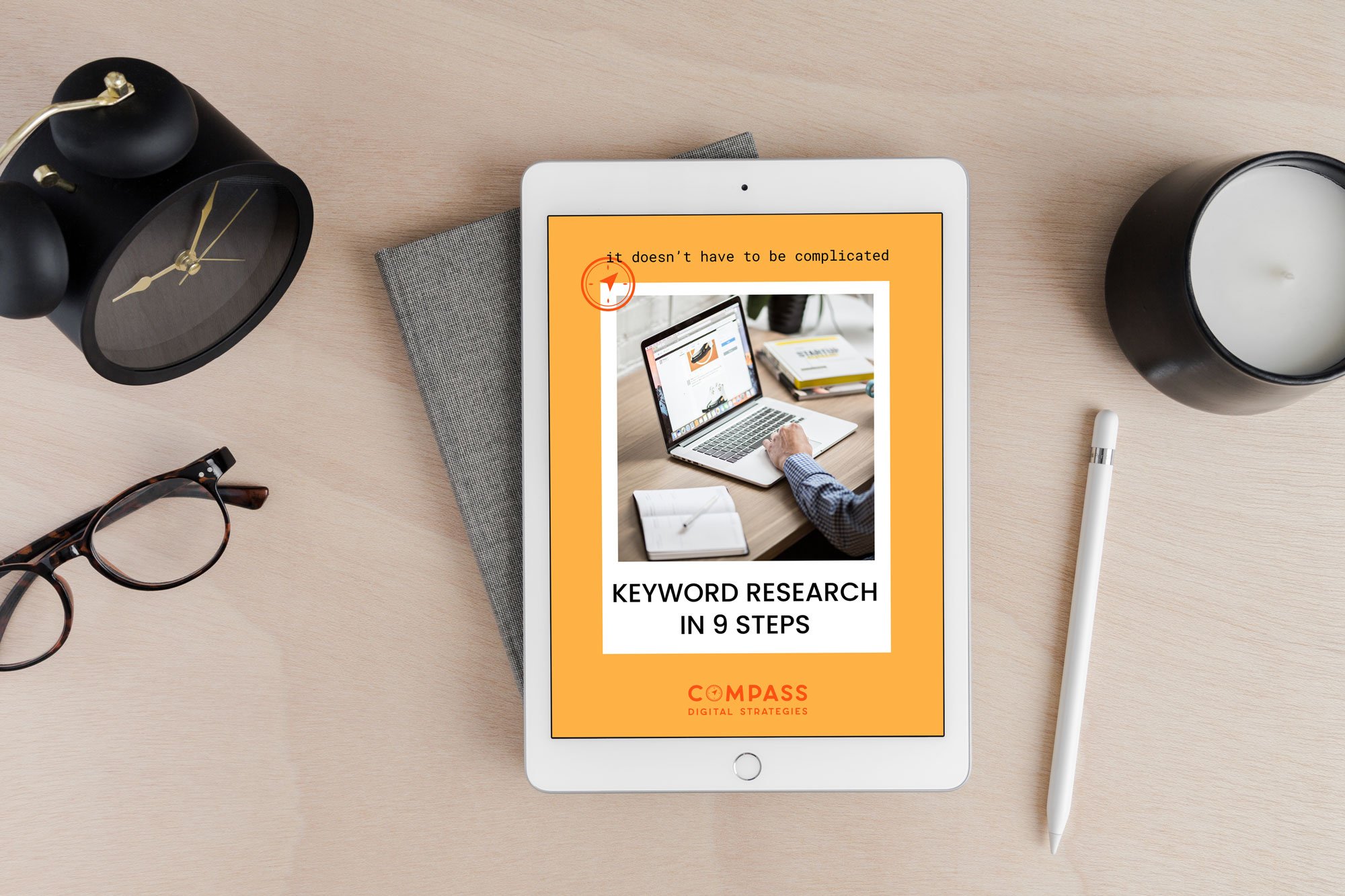
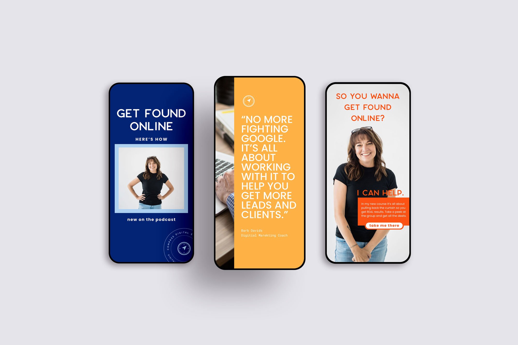
Barb’s Marketing Collateral
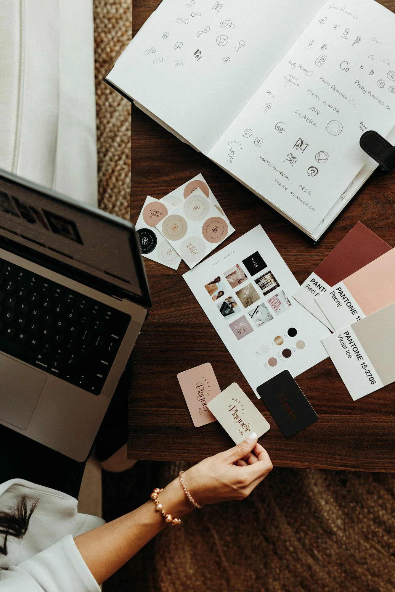
Barb’s “Quick” Brand Style Guide

The color page of Barb’s “Ultimate” Brand Style Guide

Takeaways:
In the first half of the episode, Barb and RuthAnn review the Marketing Collateral Presentation and Barb shares what feedback she wants to see.
In the second part of the episode, Barb and RuthAnn have the final call where RuthAnn delivers all branding files.
The branding process took 4 weeks, which is typical for RuthAnn's Artisan Branding service.
The brand style guide provides a comprehensive overview of the brand's visual elements and guidelines for usage.
The color palette should be used moderately, limiting the use of bright colors to two at a time so the brand can look elevated.
Using brand photos can help showcase personality and differentiate the brand in (any industry but especially in) the SEO industry.


About Barb and free resources
Barb Davids is an SEO and content marketing consultant and owner of Compass Digital Strategies. Driven by data and analytics, she works hard to get business-changing results for her clients, such as 256% more website traffic and 22% more leads. In her spare time, she and her dog Stone run and travel around the US.
-
RuthAnn Rafiq
Hey Barb, how's it going? Happy Wednesday and Happy Valentine's Day!
Barb
Happy Valentine's Day. I am loving my rebranding project. Little corny, but there you go.
RuthAnn Rafiq
That's good, yes, I'm so thrilled. I'm loving it too, and honestly, you're making the process so easy for me. And so when we left off last time, so we're recording this on a Wednesday, and on Friday I sent you the marketing collateral, and it's so cool to see all the pieces come together. And you did have feedback for me, so let's go into your thoughts about the marketing collateral and what feedback you had.
Barb
Yeah.
Barb
Mm -hmm.
Barb
Yes, thank you. I think this is like the funnest part of it because I can see it in action and that really helps kind of pull it all together and see how it's going to resonate and brings it to life basically. I think the fonts at my first initial reaction was like, hmm, I'm not so sure about it because it's so different, right? Like I'm not used to that particular font. It was a little bit playful, which is good. I'm just not used to it because I'm always like doing the rigid like ones and I'm glad that you did not pick a script font because that's definitely not me. So you definitely got my brand. That I just think they're so hard to read and I think everybody's doing them and I'm just not a fan of those. So that was good to see. The one font that I thought was different, I think it was the main one. There was an apostrophe that looked sort of out of place. So I don't know if it's possible to like change the font but kind of keep the same feeling with it at all.
RuthAnn Rafiq
I know exactly what you're talking about. This is in one of the Instagram graphics. I had an apostrophe in there and that font is very different. It has like a, it has an art deco feel to it. So it's positioned like the letters. It's very unique and interesting and it is, it has like a whimsical vibe.
But I know what you're talking about. I can see it right now because I have it pulled up that the apostrophe is like really low. It's like in the middle almost and it should be like at the top. So what I would do in that instance is you could you could highlight because I did this in Canva. You could highlight that apostrophe change it to a different font completely like any other font and all you're doing is changing where that apostrophe lands because it's a different font. If that makes sense.
Barb
Mm -hmm.
Barb
Okay.
RuthAnn Rafiq
Oh, actually, now that I'm saying that, I don't think you can do that in Canva because you have to highlight whatever's in the text box has to change the whole thing. OK, so what I would do in this instance is I would take out the apostrophe altogether. So I would. So in this graphic that I designed, it said, here's how you get found on Google. I would take out the hears and I was I would just write how to get found on Google. So I would just try to use.
I would still use the main font because that's the main one and that's like your headline font. So I would still use it and try to just use it without apostrophes. Or you could substitute the word you're trying to write with a similar font. Or you can use one of the other fonts in your brand palette. So you can use, I have the two other fonts in there too. So if you're wanting to use an apostrophe, you can substitute the main font for one of the other two, or you can try to not use one.
Barb
Okay, so you know what I'm, realistically what I would end up doing is not using the font at all because it's too much thought work to doing with the, trying to figure out the apostrophe or no apostrophe and what I'm writing. So that's what would probably end up happening.
RuthAnn Rafiq
Mm -hmm. So you wouldn't use it for the headline at all.
Barb
I wouldn't even try to use the font if I have to think about whether or not I'm using an apostrophe or not because most of the time when I go in there and I'm doing headlines or whatnot, like I don't want to have to switch it back and forth all the time.
RuthAnn Rafiq
Mmm.
RuthAnn Rafiq
Mm -hmm. Yeah. Oh, I totally get that. I do think that it does add a lot of personality, but you could substitute it with that other font that we have in there. And the one that we use is brand and grotesque, but they don't have that in Canva. So the very similar one that we'll use is, I think it's Poppins something. So you can definitely replace that main one with.
Barb
Mm -hmm.
RuthAnn Rafiq
the other font and I have that for you in the brand style guide. It says like these are your Canva replacements. And so you can definitely switch it out.
Barb
Okay, that's super helpful.
RuthAnn Rafiq
Yes, it is still a sans serif. It's still friendly looking, the font is. So I don't think you're losing too much. If you're switching out the headline, that should be fine. And then what other feedback did you have? Because I think you had some other feedback.
Barb
Okay.
Barb
I think it was nice to see the watermarks in there because some of them are hard to read and some of them are depending on how big the watermark is based off of like what's in the graphic. So I definitely think that the watermark without the text makes more sense for my, for the social pieces of it, which was nice to see.
And I don't know, I know that most of them had like my image, my brand image, if I could get an example with just text on the front page, what that would look like.
RuthAnn Rafiq
Yes, you're referring to the optins without a photo of you on the front.
Barb
the social, the posts piece. Just that, just the post one, yeah.
RuthAnn Rafiq
Also the post. Okay, so you wanna see like some without your image. Yeah, cause I did use your image and I think all of them. So yeah, I can do like a replacement for, you know, one or two of them with just text to see how it looks for sure. Let me write that down.
Barb
Yeah, yeah. And that's only because I think sometimes it just seems so silly to put my face on like some of the top ones when I want them to, it goes back and forth. It does vary based off of whatever my mood is or what I'm working on that I would rather just have like text there. And that's sort of the tough part about my brand. It's not like a lifestyle brand. So sometimes it's like, ugh, what do I put there to help support the text?
And I don't think my face is necessarily that every time.
RuthAnn Rafiq
I totally get that. So I will replace some of these.
RuthAnn Rafiq
And do you want me to replace that as well for the opt -in? I think you mentioned that.
Barb
Yep, yep, that would be great.
RuthAnn Rafiq
And I get what you're saying. I love using your photos because you have so many good ones to choose from. And I think it's so good to like have that connection piece. But I hear what you're saying is you want some without using your face all the time, especially if you're talking about something like SEO, you want it to kind of relate more to maybe showing a keyboard or something like that. So I totally get that.
Barb
Mm -hmm.
RuthAnn Rafiq
So I will make those revisions to the graphics and I will replace that in Canva also the title, the title font. I will change that to the other font we're using just so that apostrophe doesn't look so crazy.
Barb
Cool, yeah. It was nice though to see it. It was like, I'm a real business. I have a brand.
RuthAnn Rafiq
I love that it, yeah, it really all comes together with the marketing pieces because it's cool to see the logo, it's cool to see the color palette, but you don't really see how it all works until it's all together in like a document or in Instagram graphics. So I'm so glad to hear it. And you mentioned a second ago that the watermark, which I think you're referring to the little compass design that we have in the logo. So we...
Barb
Mm -hmm.
RuthAnn Rafiq
used and I really like that logo mark. It just adds such a nice little accent to different things. And if you go check back at the, if you go back to look at our show notes page, you can see what we're talking about. Cause we use that little icon is it's kind of like a illustration in a way. Like you can use that a lot of different ways and it just adds a really nice dimension. And, and like you were saying, there is, um,
a sub mark with all the words around it, which can be a little difficult to read because there are a lot of words. But I think it's nice to have those options.
Barb
Absolutely.
RuthAnn Rafiq
Let me pull up the... Okay, so I'm just looking at the Instagram graphics. So Instagram graphics, some of them swap out.
And then the same with the page. What else?
Barb
That was it. It was awesome. I didn't really have a lot of other things that I would change about it. And I think that's what makes this project so easy. I haven't had a lot of things to have to change. It comes through and I think I've been lucky that I feel like I've been lucky that you've been able to interpret my brand and understand it. So I haven't had to like re -explain stuff and be like, nope, that is completely wrong. It's been like.
almost like right on except for the apostrophe thing I think. Like it's just, and that's like my personal thing, right? Like you don't know that kind of thing. That's just a personal preference. So that's what I like about this project. It's been super easy.
RuthAnn Rafiq
I'm so glad about that that music to my ears for sure and you know You've made it so easy as well with giving me really solid feedback. This is why I don't like something You know that kind of thing so anyone out there who's listening if you are working with it with a designer You know trying to give that solid Practical feedback is super super helpful in the process and makes it super enjoyable. So what we're gonna do next is I am gonna make these revisions and send you a revision today. And just let me know if you wanna, because we do have two revisions in this process. So you let me know how that looks and then we'll go from there. And then I am doing a logo file presentation to you on Friday. So we are gonna record that and I'm gonna present to you all of your files, explain a little bit about your brand style guide, and we'll dive into all the nitty gritty of how to use it. And then you'll be able to take your brand and run with it. And when you have questions, we can definitely do an update on this is, if you're running into these roadblocks, this is how you can keep everything aligned to your brand and keep it all cohesive.
Barb
Alright, I'm looking forward to that one.
RuthAnn Rafiq
Yes, so good. Well, I will chat with you very soon. Thank you, Barb.
Barb
All right, sounds good. Thanks for then.